


Branding & E-commerce design
Fictional local tourism platform focused on authentic experiences in Bilbao.
Bilbaotours merges the urban and the natural through a sober, modern, and symbolic visual identity, aimed at a millennial audience with an exploratory spirit.

Target Audience
Bilbaotours is designed for modern young adults — primarily millennials — seeking alternative, meaningful experiences in familiar urban environments. The tone balances visual sophistication, trust, and a sense of adventurous discovery.


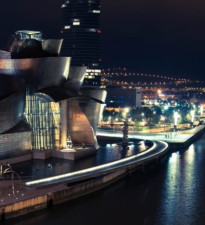
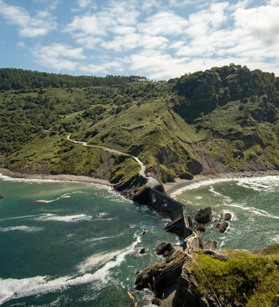
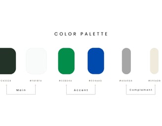
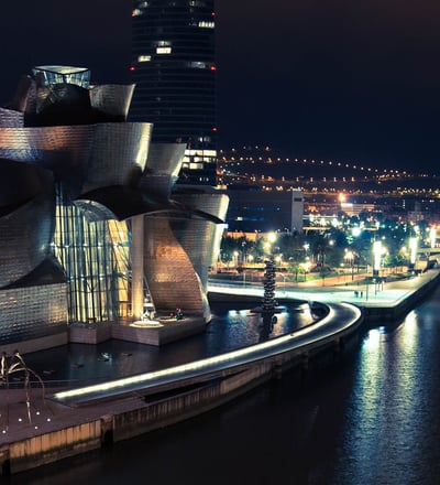
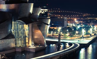
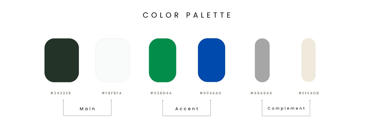
The identity reflects the essence of Bilbao: the tension between the natural and the metropolitan, the familiar and the alternative. The color palette blends greens inspired by local vegetation and the sea, with neutral tones reflecting the city's architecture.
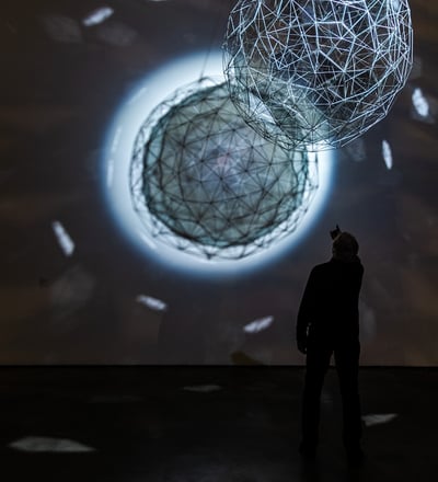
Visual proposal


Target Audience
Bilbaotours is designed for modern young adults — primarily millennials — seeking alternative, meaningful experiences in familiar urban environments. The tone balances visual sophistication, trust, and a sense of adventurous discovery.
Segmentation
Bilbao, Barcelona, Madrid, Basque Country, and frequent travelers within Spain.
Geographic:
Demographic:
Aged 25–40 / Creative or digital professionals / Mostly without children.
Curious, conscious, design-sensitive, tech-oriented, seekers of nearby exploration.
Psychographic:
#Keywords
Behavioral:
Shops online / Browses on social media / Values design / Reads reviews / Shares experiences.
> “unique Bilbao experiences”, “alternative local tours”, “travel without leaving the city”, “sustainable getaways”, “Bilbao travel e-commerce”, “discover the hidden”, “urban green routes”
The identity reflects the essence of Bilbao: the tension between the natural and the metropolitan, the familiar and the alternative. The color palette blends greens inspired by local vegetation and the sea, with neutral tones reflecting the city's architecture.
Visual Proposal

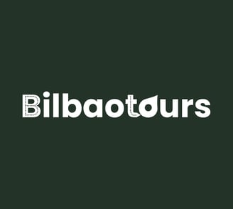
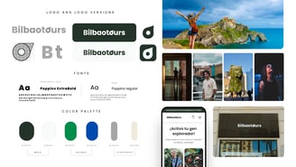
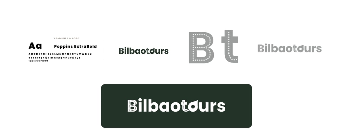
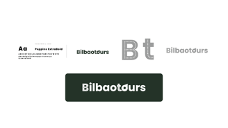
Logotype Design
The logo fuses typography and symbol in a balanced and meaningful structure: The letter “O” doubles as a compass icon. The isotype represents travel paths and movement, symbolizing orientation and discovery. The chosen typography combines sobriety and fluidity to convey professionalism, clarity, and visual dynamism.
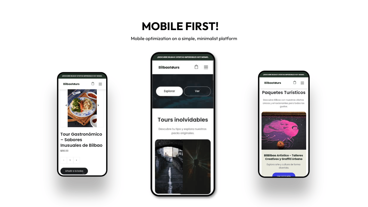
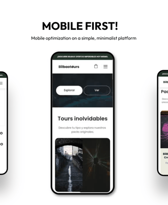
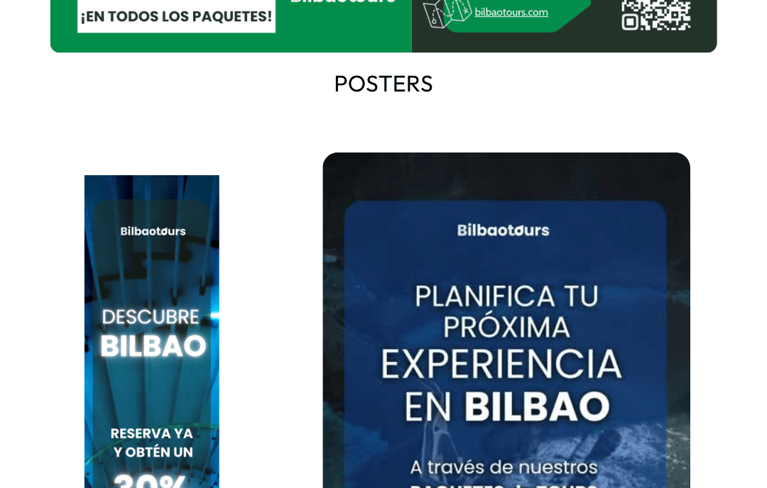
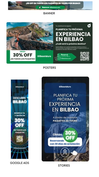
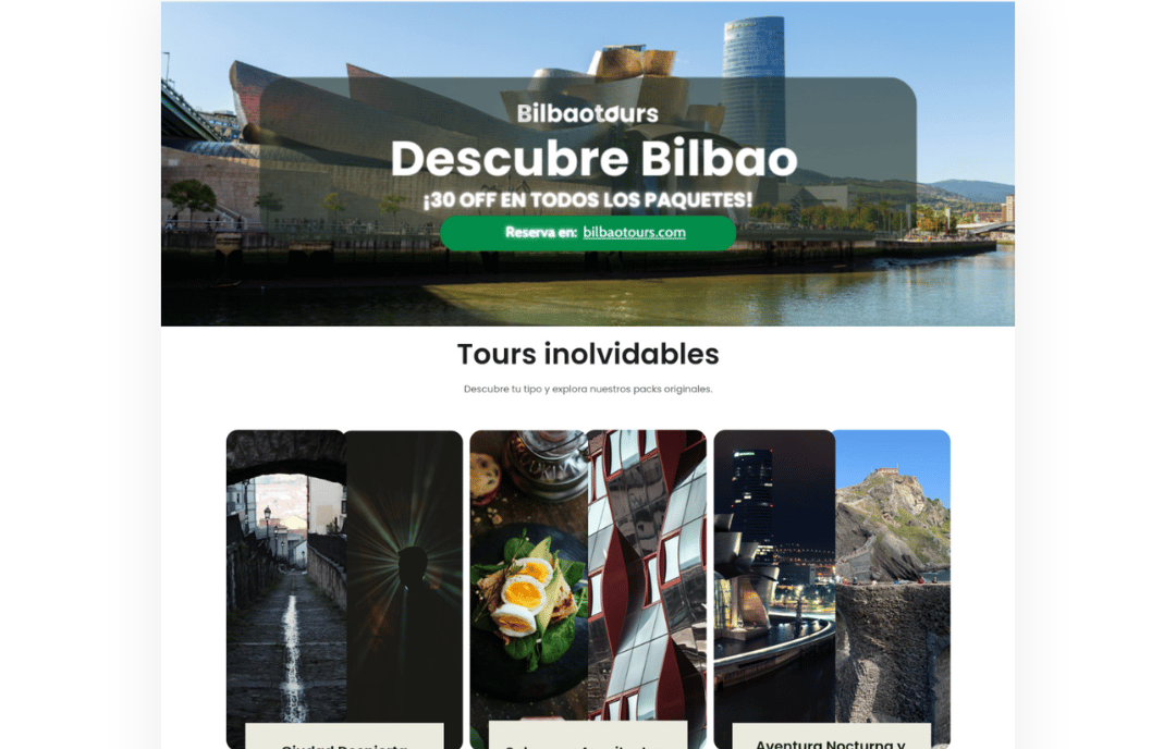
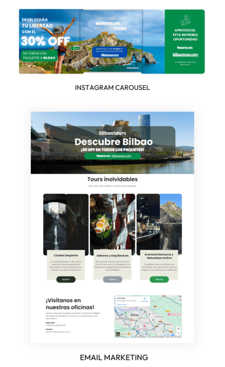
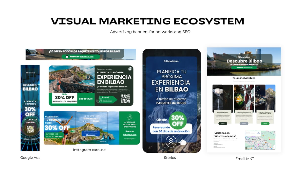
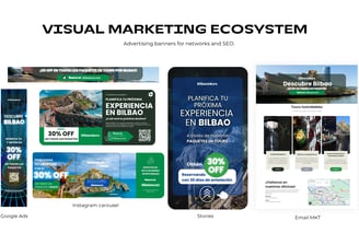
El diseño UX/UI fue planteado con enfoque mobile first y una navegación sencilla. El ecosistema de marketing visual incluye banners para redes, campañas de e-mail marketing y visuales para Google Ads, con una estética limpia, coherente y adaptable.
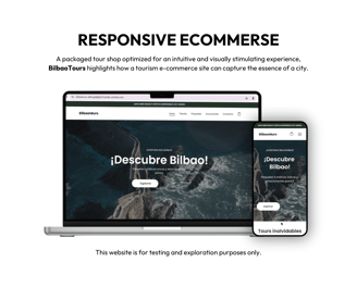
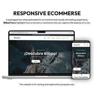


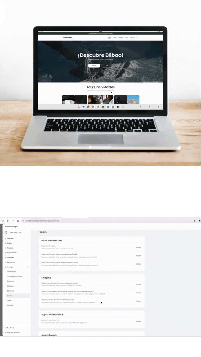
Ecommerce with easy management, uploading, and order fulfillment with Hostinguer's Builder.

Symbol Use
The isotype is adapted for use across different key platforms, ensuring brand recognition at multiple scales.

Visual Adaptability
Bilbaotours’ isotype was designed to work as a standalone symbol in multiple formats: favicon, app icon, social media, and digital signage. Its simple geometry, strong contrast, and symbolic load make it recognizable even at reduced sizes while remaining coherent with the main identity.
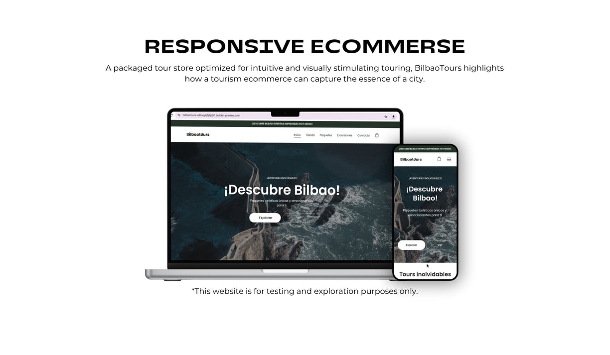
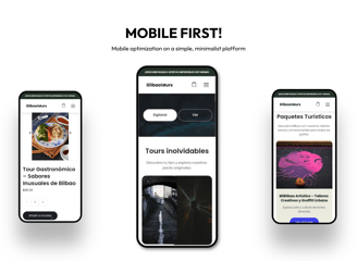
The UX/UI design follows a mobile-first approach with intuitive navigation.
The visual marketing ecosystem includes banners for social media, email marketing campaigns, and Google Ads — all designed with a clean, cohesive, and adaptable aesthetic.


©ailenworks 2025. All rights reserved.